Real 10-Year Bond Yield
Perspective
Bonds Are Frickin' Expensive
August 13, 2019
Topics - Fixed Income
First, a disclaimer. We are not suddenly pro-market timing. We have always either advocated against it, or, at the most, argued for sinning a little (meaning don’t do much of it or only do it at true extremes – and even then don’t do that much of it!). Still, whether you’re going to do anything about it or not, 1 1 Close We indeed “sin a little” in our most unconstrained portfolios – though in many mandates we don’t, in order to maintain market neutrality at all times as best we can (it’s always a best guess). please just view this as a posting. When something as important as the U.S. bond yield hits historical extremes, it’s worth at least a discussion, though certainly not an automatic huge short. There are also some other interesting things to examine along the way about the long-term relationships between real bond yields, real T-bill yields, the slope of the yield curve, and economic conditions.
I’m going to look at two measures commonly used to evaluate the attractiveness of the U.S. 10-year bond, measured fairly simply (in real life models we can get a little crazier, hopefully in a good way):
1. Real bond yield is just the 10-year Treasury yield minus 3-year trailing annualized CPI inflation (a typical thing you might do to try to improve this is use a more forward-looking forecast of inflation).
2. Slope of the yield curve is just the 10-year yield minus the T-bill yield.
I think of 1) as a “value” measure for bonds and 2) as a “carry" measure. 2 2 Close While certainly directionally right, the slope of the yield curve isn’t precisely accurate as the “true” carry (I define “true” carry as your return assuming an unchanged yield curve). A more accurate measure would also incorporate the local slope of the yield curve around the bond’s maturity. Broadly speaking we think a bond investor generally would like more of both (all else equal). Here’s a graph of this version of real bond yield since 1955:


Source: AQR,
Reuters. Inflation is defined as the average 3-year inflation rate annualized. For illustrative purposes only and not representative of any portfolio that AQR currently manages.
Today’s value is pretty darn low. Not quite as low as a few years ago, but 5th percentile low over more than 60 years.
Next we graph the slope of the yield curve:
Slope of the Yield Curve


Source: AQR,
Reuters. The slope of the yield curve is defined as the 10-year yield minus the
3-month T-bill rate. For illustrative purposes only and not representative of
any portfolio that AQR currently manages.
Again, pretty darn low (the current value is also 5th percentile since 1955). 3 3 Close As the plots make clear, the slope of the yield curve moves around more than the real bond yield (the short-rate can be very volatile, with the early 1980s being an extreme example).
So, we have two signals. Let’s do the logical thing and average them. Note, we can think of it as just this, the average of two signals, or equivalently as the 10-year Treasury yield minus the average of short rates and inflation (as both measures are the 10-year Treasury yield minus one of those two). Here goes:
10-Year Bond Yield Minus the Average of Inflation and T-Bills


Source: AQR,
Reuters. Based on the real bond yield and yield curve slope as shown in the
prior charts. For illustrative purposes only and not representative of any
portfolio that AQR currently manages.
This measure is essentially at a 64-year low (less than the 1st percentile), with a value not seen save for a pair of months in the late 1970s. Pretty wild considering some of the times we’ve lived through (including the post 2008 period of “financial repression” when real bond yields got a bit lower than today but the curve was generally upward sloping, making the average of the two measures not nearly as low as today).
You might be surprised the combo is much worse than the two individual signals. You expect this when combining uncorrelated signals that are both at big negatives, as it’s much more statistically shocking to see both so low at the same time. But you don’t expect it for very correlated signals. And surely, real bond yield and the slope of the yield curve are highly positively correlated, right? I mean they both start with the same 10-year Treasury yield and both subtract related measures that each average less than the 10-year. One just subtracts inflation and the other short rates. They must be at least fairly similar, no?
Well, you might have noticed this from the charts above (those who can do correlations in their head!) that they are not very correlated at all. Over this period these two seemingly quite similar series are only 0.07 correlated. When two measures, 0.07 correlated, are both near historic lows, the average of them indeed tends to be a whopper (as it is). 4 4 Close This result isn’t altered if you look at changes in these signals. If instead you compute the correlation of the monthly changes in the real bond yield and the slope of the yield curve, you get 0.13.
While not the central point here, it might be interesting to explore why this correlation is so low (and so much less than what I think our collective intuition might’ve guessed). As always I remind readers that this is a blog and not a research paper. I have chosen one measure of economic activity (trailing 3-year growth in industrial production) and below I use it to see if we can shed some light on this puzzle. I think the forthcoming results are interesting, but this would have to be subject to a ton more testing (robustness to other reasonable measures, look-back periods, etc.) before you’d want to feel any certainty about it.
Let’s break up the real bond yield into two parts:
1. The real T-bill yield (T-bill yields minus our inflation proxy)
2. The slope of the yield curve we’ve been measuring up until now
These two are -0.53 correlated over this 1955-present period. I think this is pretty intuitive. If you imagine a string starting at the inflation estimate, going to the T-bill yield, and then on to the bond yield, if you pulled up on that string at the T-bill rate, you’d raise the real T-bill yield and lower the slope mechanically. But let’s try to get a bit more economics involved.
The real bond yield we’ve been using is the sum of these two measures (real T-bill yield plus slope). First, how much are T-bills above inflation. Second, how much are longer term treasuries above T-bills. Together you get the real bond yield.
The correlation (1955-present time series correlation) of the slope of the yield curve with trailing industrial production is a quite negative -0.58. This makes sense. Near the peak of a business cycle, when trailing industrial production is likely the strongest, you often see a flat or even inverted curve as central banks attempt to take away the punch bowl.
Next, the correlation of real T-bill yields with the same trailing industrial production goes strongly the other way (coming in at +0.57). Again, this makes sense. A strong economy is associated with higher real interest rates, and perhaps a Fed trying to slow things down by raising short rates above inflation (I won’t get into disentangling that one). 5 5 Close Basically, central banks manipulate the front end of the curve. They do this to influence longer term yields, which are anchored to expectations of future short-term rates, real economic activity, and inflation. What happens when the central bank raises rates? The front end of the yield curve goes up and the back end tends to go up by less. So, the curve flattens and, since inflation expectations tend to be sticky, real bond yields increase.
Now, since the real bond yield is the sum of these two (slope and real T-bill yield) it’s not surprising its correlation with industrial production is in the mushy middle (0.27 over our 1955-present sample). So the real bond yield is 0.27 correlated with our industrial production measure and the slope is -0.58. Now it’s suddenly less shocking the two aren’t correlated with each other.
Essentially, the slope and real bond yield are very weakly correlated with each other, and one (perhaps not “the”) culprit seems to be the strong opposite relation of real T-bill yields and the slope of the curve to economic conditions. All very intuitive, but probably not something most of us would’ve guessed if asked, “how correlated are real bond yields with the slope of the yield curve?”
Here’s another way to look at it. The following is the full period monthly regression of the yield curve slope on the real bond yield: 6 6 Close In the two regressions that follow, standard errors are Newey-West-adjusted using 18 lags to account for autocorrelation in the estimated residuals.
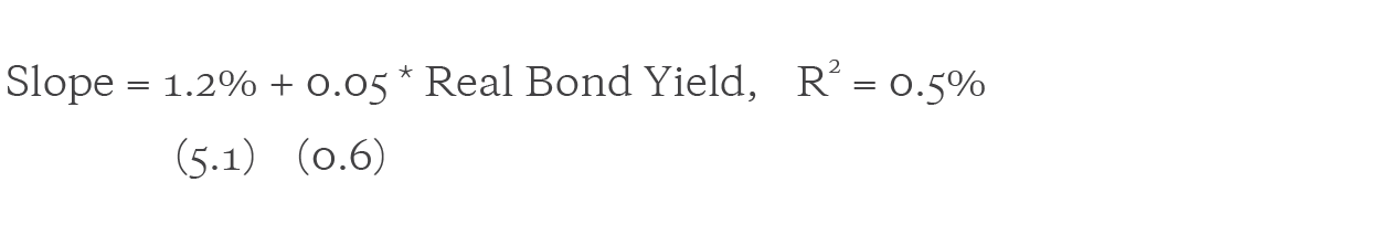
Nothing surprising, of course, after knowing the correlation is very low: an economically and statistically very small positive relationship. Now let’s add trailing industrial production to the regression:

Nothing earth shaking here, but pretty intuitive. We knew above the slope was strongly negatively related to recent growth in industrial production. But, by accounting for this relationship, we more than triple the economic relationship of slope with real bond yield (i.e., the coefficient goes from 0.05 to 0.17) and the coefficient on real bond yield goes from statistically insignificant to statistically significant (if certainly not earth-shattering). Clearly there is more going on than can be accounted for by just this one arbitrarily picked measure of economic strength – but it does aid our understanding. Part (maybe more if better measures are found) of the weak negative correlation of slope and real bond yield comes from their very different, and confounding, relationship with the state of economic growth.
So, the bottom line is, as measured by real bond yield, U.S. Treasury bonds are really frickin’ expensive. Measured by the slope of the yield curve they are really frickin’ expensive. But, measured by the average of these two simple variables, they are 60+ year just about record-low frickin’ expensive. This result is not caused by, but is certainly exacerbated by, the (perhaps) surprisingly uncorrelated nature of slope and real bond yield, thus making both so low and at the same time considerably more surprising.
But, yet again, we caution against market timing based on just valuation. For instance, Japanese bonds have, on various metrics, been incredibly expensive since many of today’s traders were in short pants. 7 7 Close It’s perhaps worth noting that in Japan, the real bond yield and the slope of the yield curve, while low versus their own histories (both 13th percentile back to January 1973), are not as low (in percentile terms) as what we see in the U.S. Source: Global Financial Data, as of August 7, 2019. Furthermore, the U.S. bond yield might be record low on our combo value/carry metric, but it’s still high versus some major parts of the world attempting to discover how negative a government guaranteed bond can yield before savers build private fortresses to store cash.
Still, we thought that one of the (if not “the”) premium benchmarks in the world hitting near 60+ year lows (including versus the post-GFC “repression” period) on a combination of very basic measures of bond attractiveness, and amidst a still reasonably strong U.S. (if not global) economy was worth a mention (and some reasonably cool analysis of how different parts of the curve and different metrics respond to economic conditions).
How much, if at all, you choose to sin or not sin because of super-low U.S. yields, is, of course, up to you. Our recommendation is, again, you probably should do less than you first think.
Finally, in the interest of full disclosure, it’s worth noting that we do have at least somewhat of a horse in this race. In an ongoing quite tough time for many liquid alts, and an ongoing long- and short-term bull market in bonds, many seem to be asking, “hey, maybe bonds are a better diversifying asset than alts?” While we are clearly circumspect about betting a lot on contrarian market timing, we are certainly way more than circumspect, downright suspect, of this kind of anti-contrarian market timing!
This document has been provided to you solely for information purposes and does not constitute an offer or solicitation of an offer or any advice or recommendation to purchase any securities or other financial instruments and may not be construed as such. The factual information set forth herein has been obtained or derived from sources believed by the author and AQR Capital Management, LLC (“AQR”) to be reliable but it is not necessarily all-inclusive and is not guaranteed as to its accuracy and is not to be regarded as a representation or warranty, express or implied, as to the information’s accuracy or completeness, nor should the attached information serve as the basis of any investment decision. This document is intended exclusively for the use of the person to whom it has been delivered by AQR, and it is not to be reproduced or redistributed to any other person. The information set forth herein has been provided to you as secondary information and should not be the primary source for any investment or allocation decision. Past performance is not a guarantee of future performance.
This material is not research and should not be treated as research. This paper does not represent valuation judgments with respect to any financial instrument, issuer, security or sector that may be described or referenced herein and does not represent a formal or official view of AQR. The views expressed reflect the current views as of the date hereof and neither the author nor AQR undertakes to advise you of any changes in the views expressed herein.
The information contained herein is only as current as of the date indicated, and may be superseded by subsequent market events or for other reasons. Charts and graphs provided herein are for illustrative purposes only. The information in this presentation has been developed internally and/or obtained from sources believed to be reliable; however, neither AQR nor the author guarantees the accuracy, adequacy or completeness of such information. Nothing contained herein constitutes investment, legal, tax or other advice nor is it to be relied on in making an investment or other decision. There can be no assurance that an investment strategy will be successful. Historic market trends are not reliable indicators of actual future market behavior or future performance of any particular investment which may differ materially, and should not be relied upon as such.
The information in this paper may contain projections or other forward-looking statements regarding future events, targets, forecasts or expectations regarding the strategies described herein, and is only current as of the date indicated. There is no assurance that such events or targets will be achieved, and may be significantly different from that shown here. The information in this document, including statements concerning financial market trends, is based on current market conditions, which will fluctuate and may be superseded by subsequent market events or for other reasons.
Broad-based securities indices are unmanaged and are not subject to fees and expenses typically associated with managed accounts or investment funds. Investments cannot be made directly in an index.